


Design
Logo
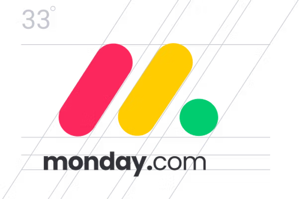
Our logo is based on our platform's three main statuses, with the three colors representing “Stuck”, "Working on it", and “Done”.


Main logo
Avatar+text
Avatar+text (small)
avatar
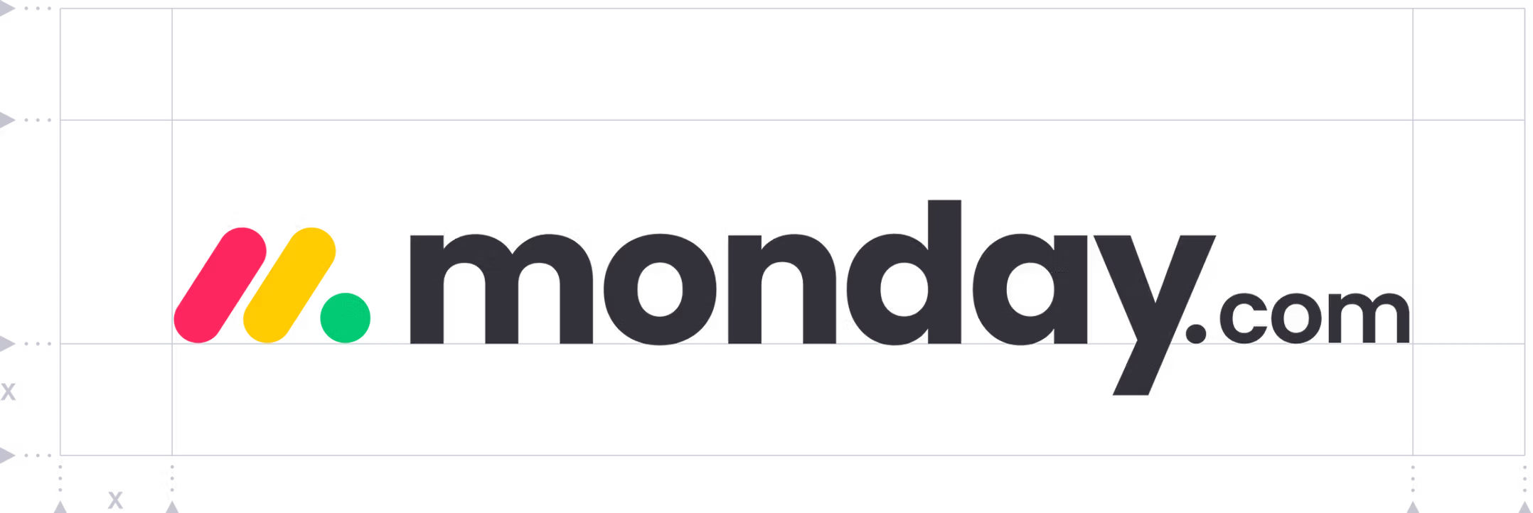
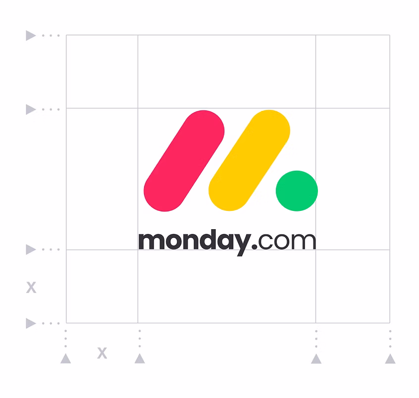
Logo construction
Our logo is based on simple shapes. The space between the three elliptical shapes (the monday’s ‘m’) and the letter M creates balance. Optical kerning, refined proportions, and delineated placement in relation to the other elements help to make the logo instantly recognizable in all contexts.
Logo do's and don'ts


Do


Don't
remove the .com

Don't
tilt

Don't
delet the symbol

Don't
use one color

Don't
deform or manipulate

Don't
change the proportions

Don't
place the text above

Don't
change the space
Logo on top of solid color
Primary
The best appearance of our logo is on a primary background, with enough clear space.

Capsule
The best appearance of our logo is on a primary background, with enough clear space.
#00854D
C100 M0 Y100 K24
Pantone 3500 C
#D79700C0
M32 Y100 K10
Pantone 7550 C
#B1123B
C10 M100 Y70 K24
Pantone 207 C